Seven studies · Scroll slowly
Ways of revealing
Each section below is one technique for letting a photograph into the page without letting it shout. All of them use the site's existing structure and theme; pick the two or three that feel right and we fold them in.
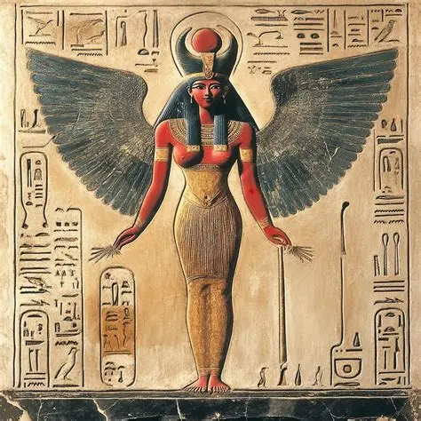
I was thinking of these styles, like the portal, for images that you do not want to be loud, yet also provide an atmosphere. For example, if you use the Goddess Hathor like you discussed earlier, the website isn't about Hathor, but she would be there to influence the vibe or atmosphere of the site.
Study 01 · Full-bleed
The still window
Your peephole idea, and it is not dated when done this way. The photograph is perfectly still; the page glides over it. Each band holds its own image, so Hathor can own one band, the treatment room another, people a third.
What made the 2010s version feel dated was fake motion — images crawling at a different speed than the page. Here there is none: it is stillness, which is exactly the brand. Editorial and luxury sites use this constantly today.
Between sections
A band of imagery, briefly
Content above, content below, and this in passing.
Interlude
Ordinary content resumes
Filler text: scroll on — a second window follows, tinted differently to stand in for a second photograph. In production each band simply loads its own file.
Second window
Same trick, different image
Study 02 · In-column
The porthole
The same window, shrunk to an arch inside the content. Scroll past slowly: the photograph slides behind the frame like a view through a real window. The most restrained way to carry Hathor — glimpsed, never displayed.
One migration gotcha, already handled here: the frosted
panels use backdrop-filter, which breaks the window trick
for anything inside them — so any section holding a porthole must skip
the frost (this one does, via an inline override).
Study 03 · On approach
Slow focus
The image arrives frosted and pale, then breathes into focus as you reach it — eyes adjusting to a dim, calm room. Suits treatment-room photography that should be present but unhurried.
Filler text: the frost is a heavy blur plus a slight lift in brightness, so the veiled state reads as ivory — part of the page — rather than as a broken image.
Filler text: the timing is long and eased. Nothing snaps; the room simply comes into view.
Study 04 · Architecture
The arch portal
Hathor stands in a doorway. As the section enters view the arch widens and the sepia lifts — but it never becomes a full-bleed poster. The arch remains, so the image stays an object in the room, not wallpaper.
One thing I don't like about this one is the arch is already mostly opened, so there is little effect. I think that can be tweaked pretty easily.
Study 05 · Resting essence
The brass plate
At rest, images are printed into the page as warm brass monochrome — etchings in the wall, pure atmosphere. Hover, tap, or tab to any plate and it is granted colour. Ideal for rows of images: people, rooms, the device.
Study 06 · One moment only
The parting veil
Two ivory panels part like curtains when you arrive. Theatrical — which is why it should be spent exactly once per page, on the image that most deserves a moment.
Study 07 · Typographic
Editorial glimpses
The page stays entirely typographic; a small framed image surfaces beside the line you are reading. On phones the same image sits inline as a modest thumbnail — nothing is lost, only the flourish.